
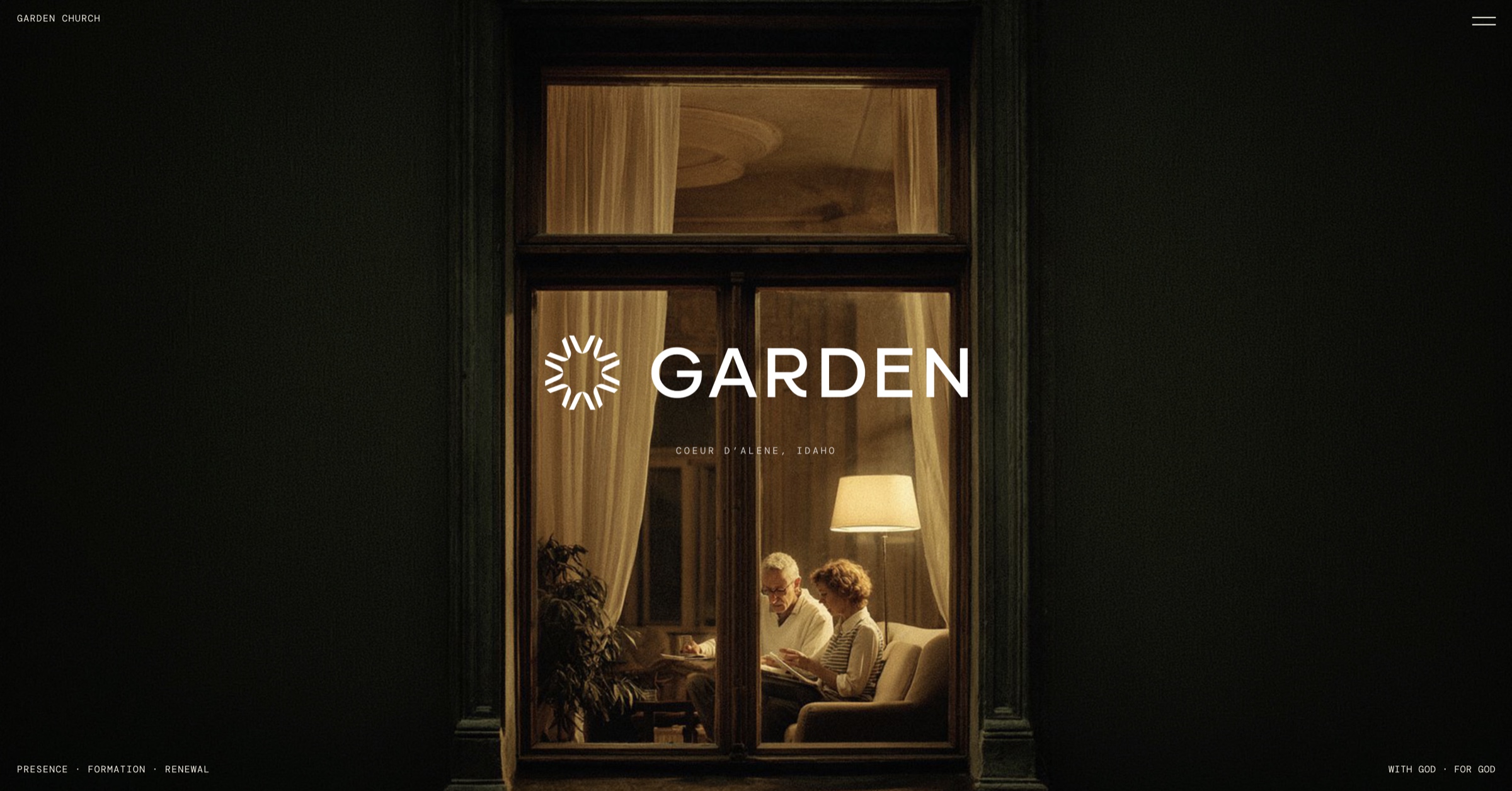
Garden Church Identity
Logo Design · Garden Church
Garden Church was planted in 2009 and renamed in 2026 to match what it had become. It ships more design per week than most startups, none of it made by designers, which makes the brand system an operational problem rather than a visual one.
The church changed its name, and a rename is the moment every inconsistency in a brand becomes visible at once. The mark also had to be drawn for the people who would use it, which here means volunteers on a deadline that does not move, not designers. An identity they can misuse is an identity that will be misused by Sunday.
Drew a nine-point symbol and locked it to a wide grotesque wordmark, supplied as one unit and never as two files, so there is no version of this identity that can be assembled wrong. Set white on green as primary and green on cream as secondary, and stopped there, because a third option is where volunteer work goes sideways. Specified color as proportion of a surface rather than as a swatch list, since the question a volunteer actually has is not which green but how much green. Documented the rules in a thirty-nine page book so the mark is defensible without me in the room.
Nine-point symbol locked to a wide grotesque wordmark, supplied as one unit. Two approved lockups only: white on green primary, green on cream secondary. Color specified as proportion of a surface, not as a palette. Thirty-nine pages across six sections: story, identity, type, color, photography, voice. Photography guidelines name the low-priority subjects, not just the high.