
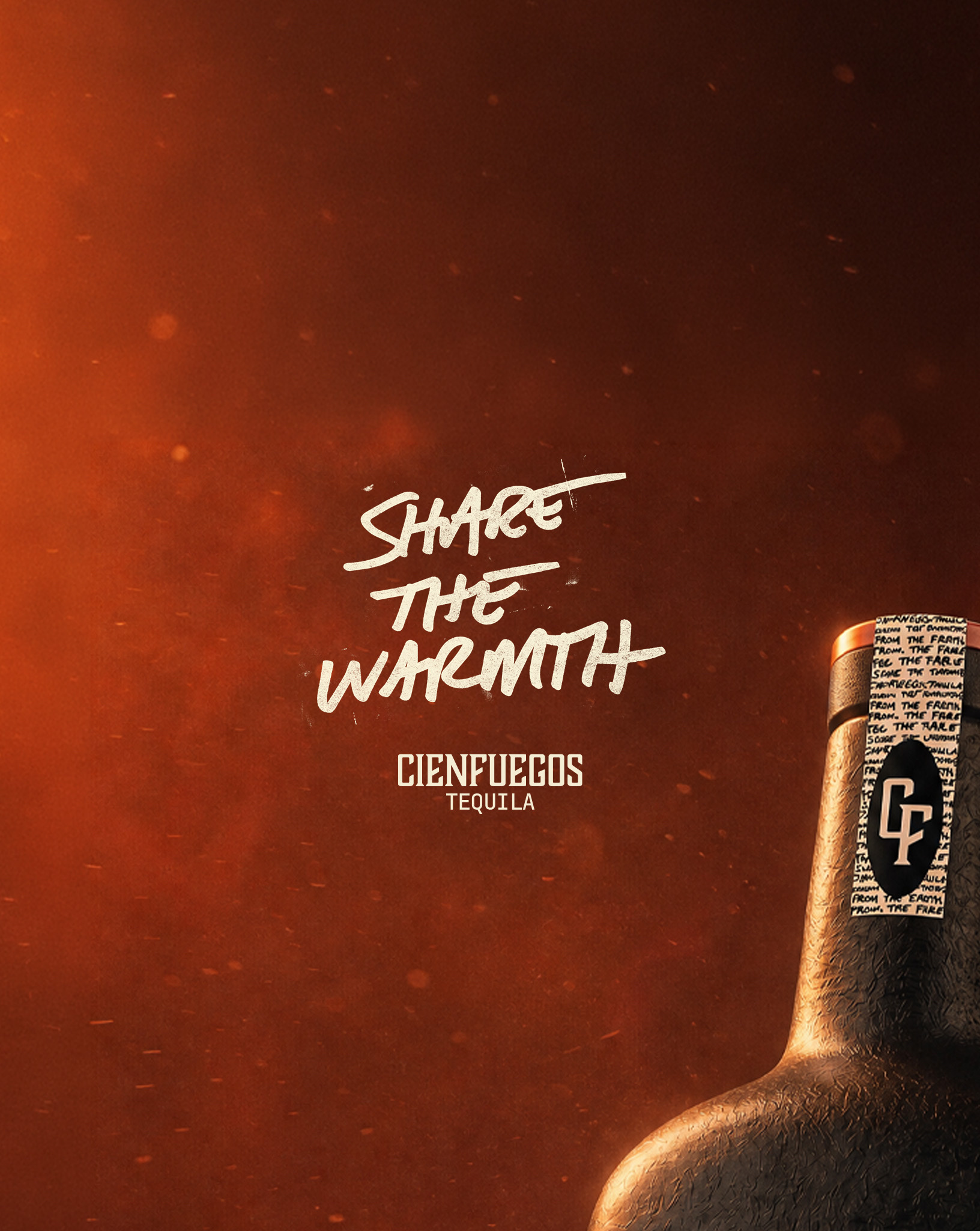
Cienfuegos Identity
Logo Design · Cienfuegos
Cienfuegos is a members-only tequila club: one release at a time, bottled in custom ceramic and numbered by hand against a thousand-count run. Members never find it in a store, so the bottle arrives as an object before it is ever a drink, and the packaging carries the entire brand argument on its own.
One brand has to sign three different things: the tequila on the bottle, the Collective that members belong to, and the club itself. The founder's original direction put a personal firefly emblem on the front of every bottle, which made the mark carry a private meaning in a public position. The assignment was a mark system that separates those jobs and survives ceramic, leather, wax, and screen.
Drew a condensed slab wordmark heavy enough to hold at bottle scale and tight enough to letter-fit under a neck strip, then built a CF monogram from the same skeleton for the seal and the cork. Added two supporting marks, an agave heart and a flame, so the brand has a symbol for origin and a symbol for process without a badge doing both. Demoted the firefly from hero mark to a hidden element placed somewhere new in every release, which honors it instead of parading it. Locked the full system in ember, tan, white, and black on char, because one of those four is always legal on whatever the release is made of.
Condensed slab wordmark, drawn to letter-fit at bottle scale. CF monogram shares the wordmark skeleton, used on seal and cork. Separate Tequila and Collective lockups off one wordmark. Agave heart and flame carry origin and process as two marks, not one badge. Firefly demoted from hero mark to a hidden per-release element. Four approved colorways: ember, tan, white, black on char.